Workstrings
Refreshing the Workstrings Identity
Workstrings approached us with the goal of updating their outdated logo while preserving key elements of their brand identity. As a company rooted in supplying tubular rentals to the oil and gas industry, it was important that the new mark felt simple, relevant, and connected to the nature of their work. They also wanted to retain their existing color palette to maintain familiarity and continuity.
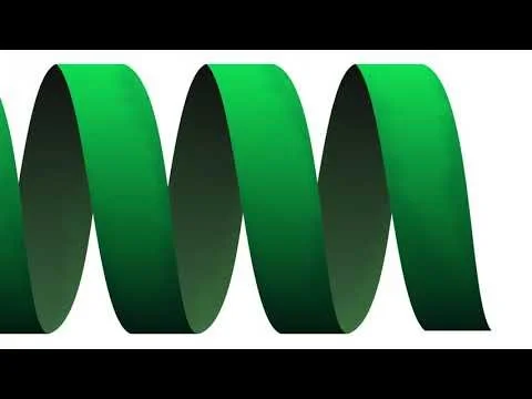
We developed a refined “W” logo inspired by the spiral seams found in tubular materials, creating a subtle but meaningful visual tie to their core business. The result was a clean, modern mark that honored the original brand while bringing it forward. To support the launch, we produced a before-and-after reveal video for their website and social channels, helping introduce the new identity in a clear and engaging way.
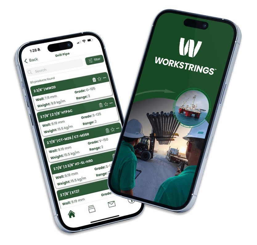
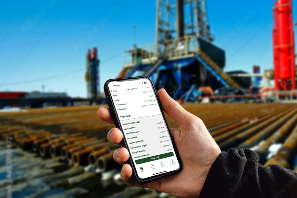
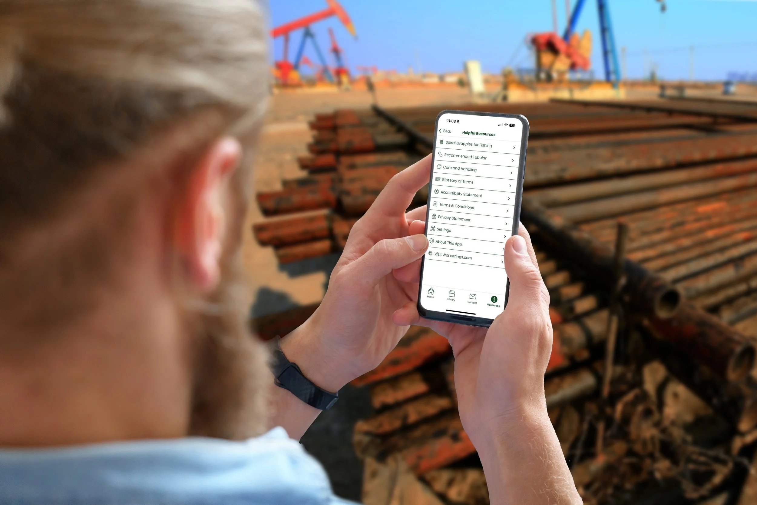
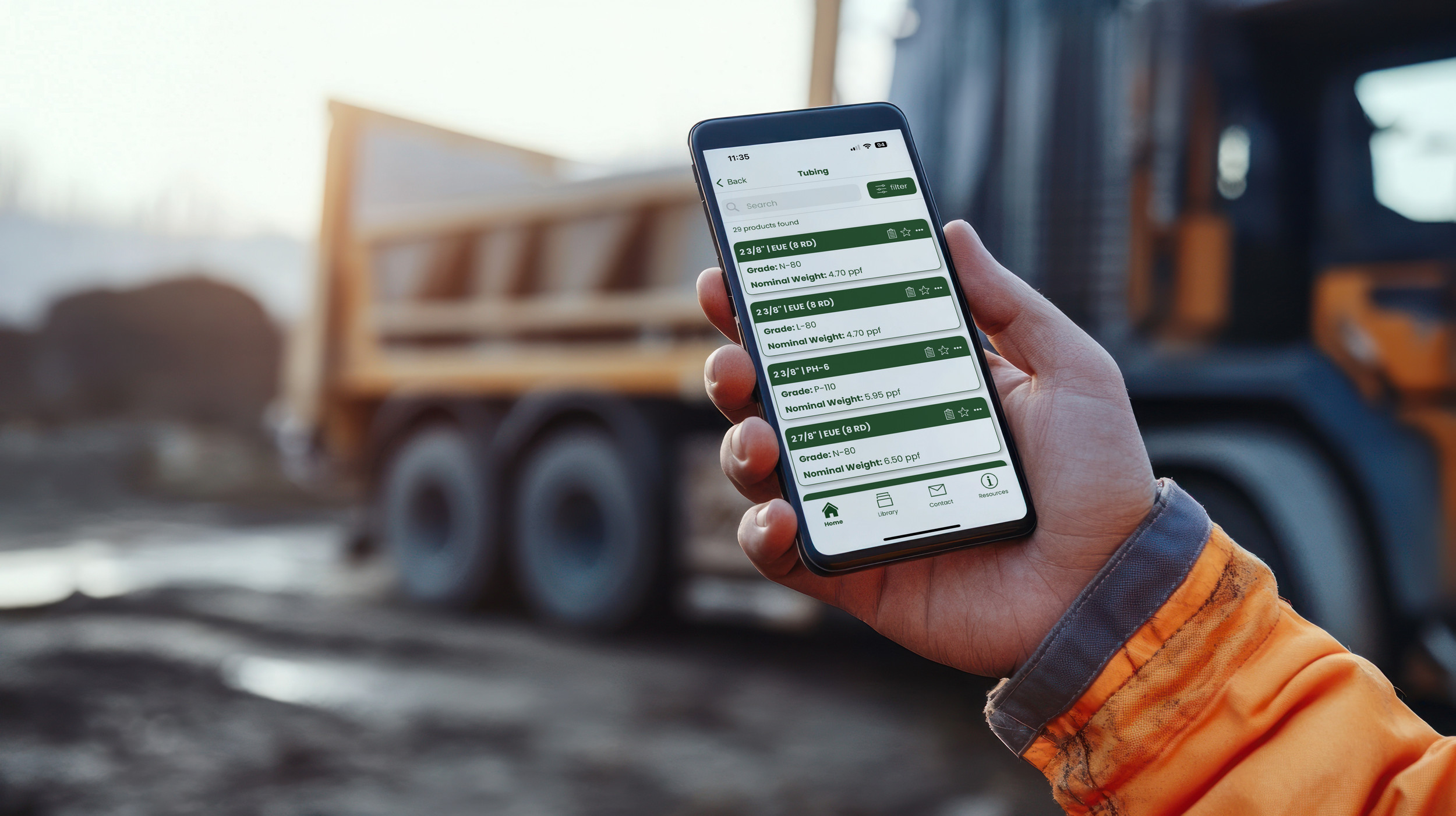
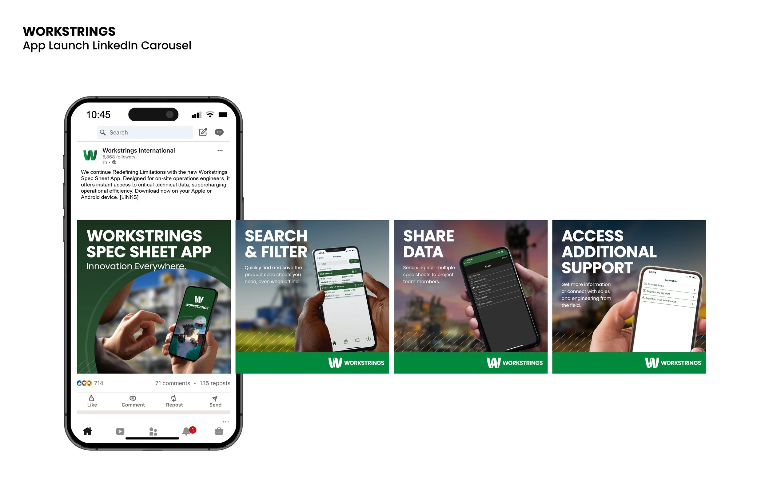
Beyond the logo, we extended the refreshed brand into a functional digital experience. We designed a user-friendly mobile app for field employees, focusing on intuitive navigation and ease of use in on-site conditions. By leveraging the updated typography and color palette, we ensured a cohesive experience across both brand and product. The new visual system was also applied across their social media graphics, reinforcing consistency at every touchpoint.
The result was a modernized brand that remains grounded in its origins, while positioning Workstrings as a more forward-thinking and connected company. The updated identity and tools were well received, generating excitement internally and strengthening their overall brand presence.